
SMT Website Redesign
View Live ProjectClient
Project type
Role
User Interviews to Identify Pain Points
User interviews with coworkers and past clients identified key issues: disorganized content that made navigation difficult and unclear communication of the product and service offerings. Users were either looking to purchase or inquire about services, but the site lacked clear pathways for each, resulting in lower retention. These problems caused confusion and impacted trust in both the product and the company's credibility.
Project goals
User Goals
- Clearly understand the product and service offerings
- Feel confident and trust the brand
- Seamlessly take action, whether purchasing or inquiring
Business Goals
- Highlight Digiscan's technology and competitive advantage
- Establish a user-friendly design to build trust and confidence
- Improve user experience and calls-to-action to increase leads and boost website traffic
solution
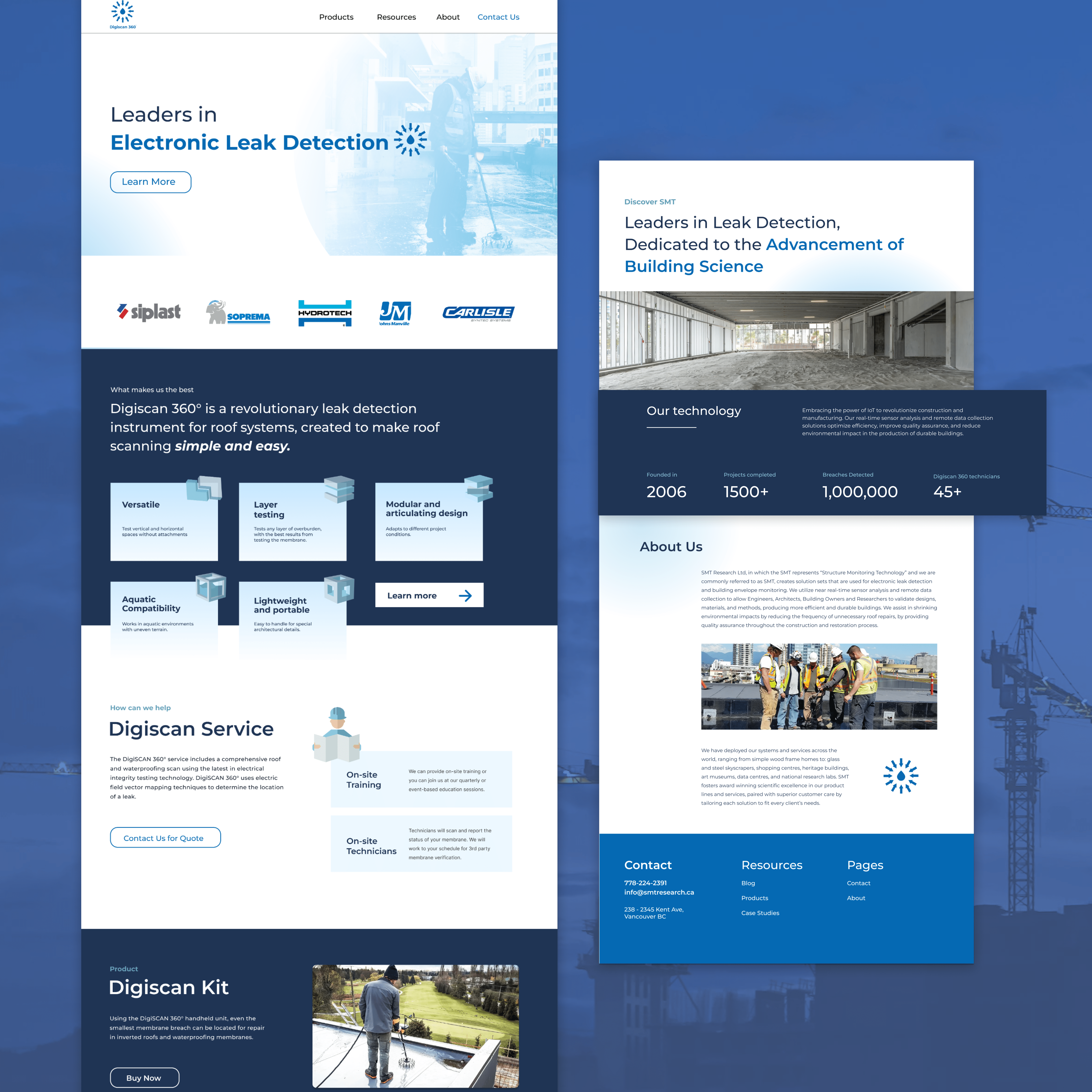
Establishing a Clear Value Proposition on the Landing Page
The first step involved redesigning the landing page to clearly showcase Digiscan's key features and its dual role as a product and service. The updated design emphasized a strong value proposition, with intuitive navigation and clear calls to action guiding users to learn more, explore product details, or make a purchase.
design process
Optimizing Navigation Framework
A new sitemap was developed to refine the site's navigation framework and improve usability. By reorganizing content categories and simplifying navigation pathways, users could locate information more efficiently. The structure was designed to support both primary user intents—purchasing the product and exploring service solutions.
Establishing Brand Consistency through a Comprehensive Style Guide
A detailed style guide was built in Figma to ensure consistency across the website, covering elements like typography, color schemes, and UI components. This guide helped reinforce the brand’s visual identity, building trust with customers. By maintaining a consistent design language cross all digital marketing efforts, it improved brand recognition and streamlined collaboration, ensuring future updates were seamless and aligned with the overall brand vision
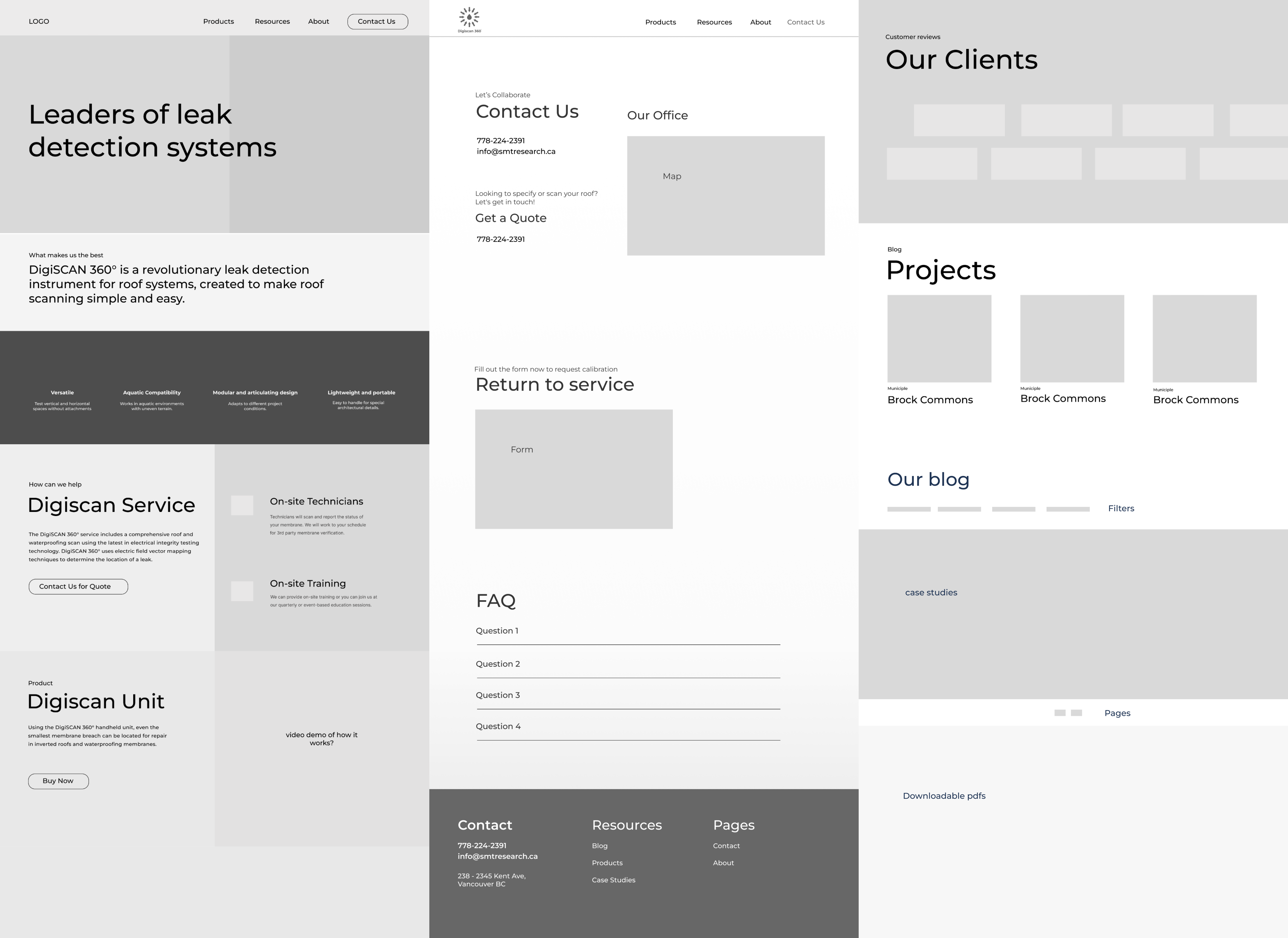
Structuring Content with Low-Fidelity Wireframes
I started by creating low-fidelity wireframes to establish the layout and structure of each webpage, ensuring the content was organized in a clear and logical way These wireframes served as a blueprint for the design, allowing me to focus on the user flow and content hierarchy. Once the wireframes were finalized, I translated them into high-fidelity designs and implemented them on the Wix platform.
Implementing the new design
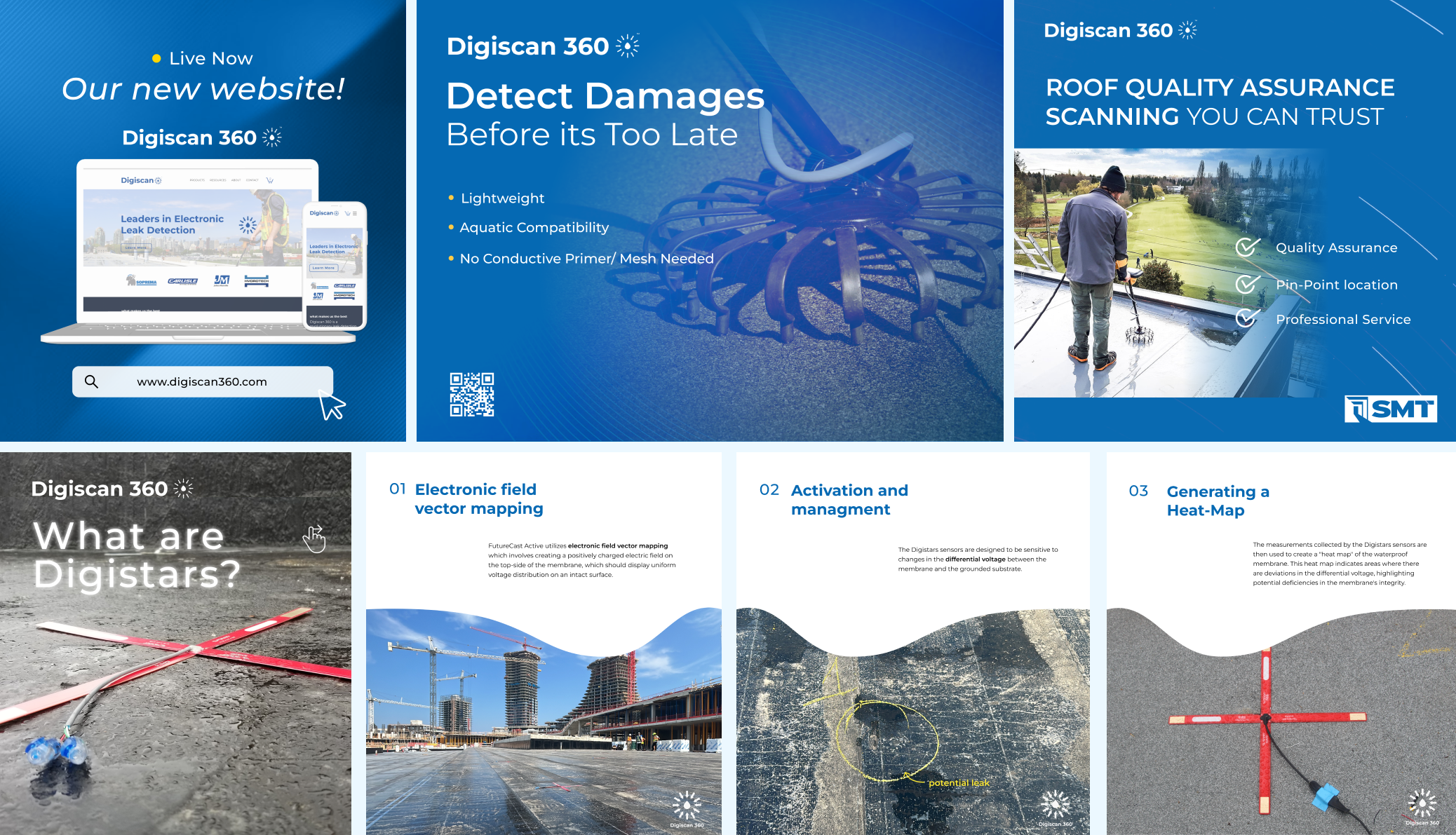
The finalized designs and assets were implemented on the Wix platform, where the site was hosted. I ran a social media campaign on LinkedIn and Instagram, repurposing content from the website to educate users, attract new traffic, and re-engage previous users.
Measuring the Impact: Results
The redesign delivered measurable improvements:
- 60% increase in website traffic within two months of launch.
- A significant rise in inquiries via the website (contact form) and LinkedIn.
- Positive feedback from users on the improved navigation and clarity of product and service information
Reflection
This project taught me the importance of defining solutions based on clear evidence and user feedback. By identifying pain points and aligning the design with user needs, I was able to create a more intuitive experience that addressed the core issues. I also learned the value of a comprehensive style guide as a tool for communicating the brand’s identity. It not only helps elevates the user experience and increases the speed and efficiency of design and development.
While seeing a increase in traffic and positive feedback was rewarding, there’s always more room to refine the user experience. Going forward, I’m excited to explore deeper user feedback and continue iterating on the design to enhance usability and engagement even further.