
Flair Airlines Case Study
View Live ProjectClient
Project type
Role
Improving Baggage Selection to Drive Higher Conversion & User Satisfaction
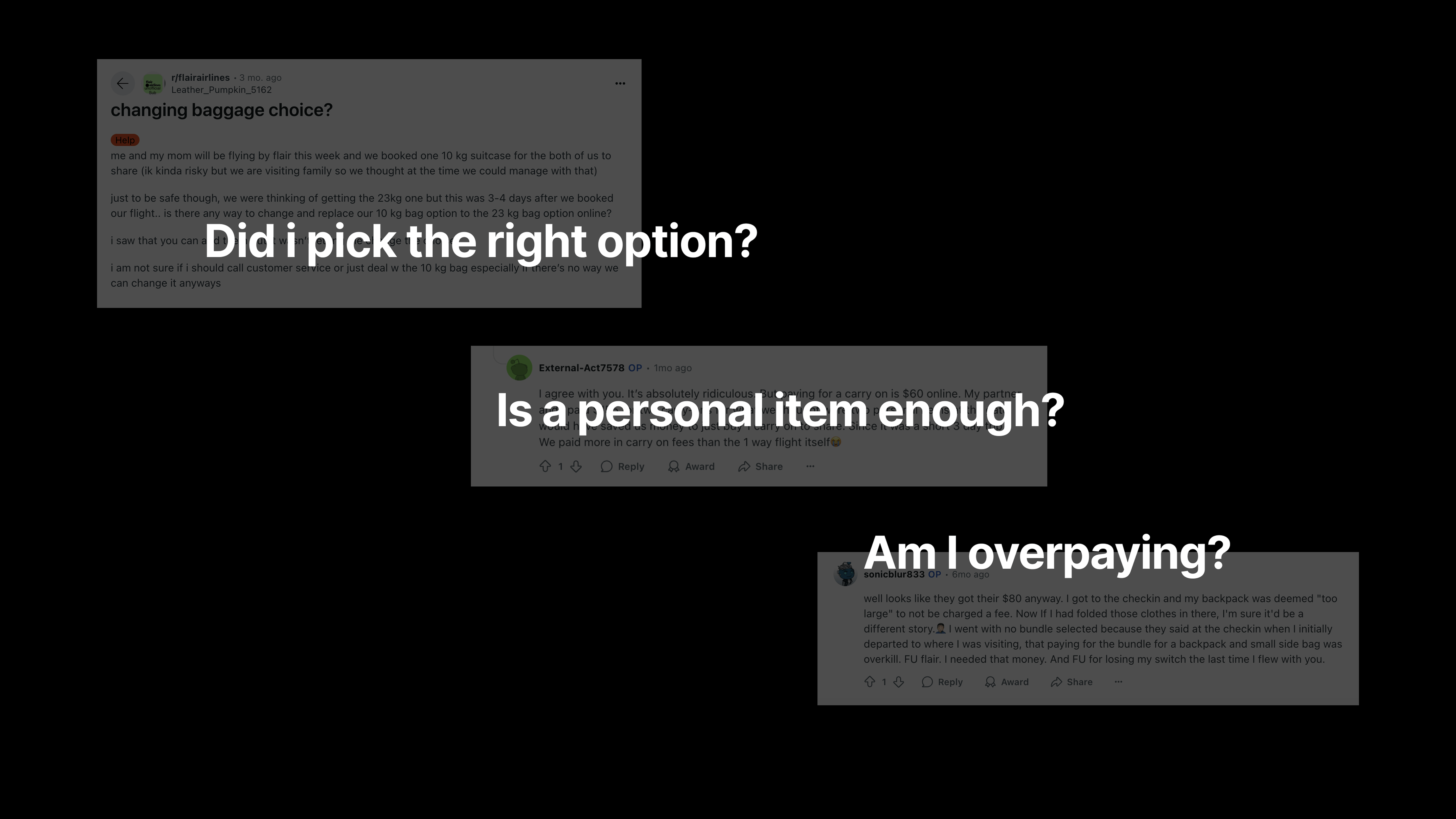
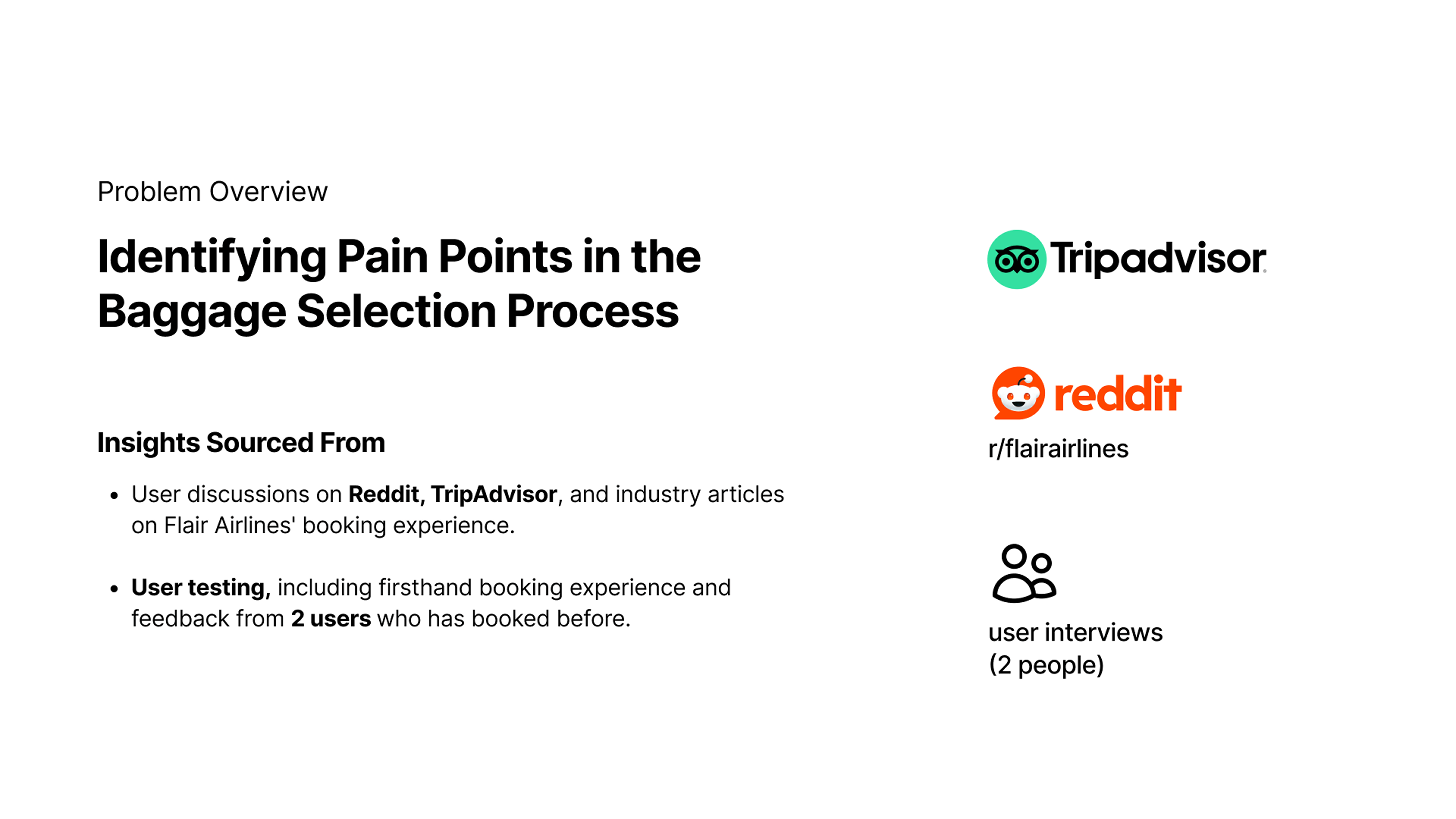
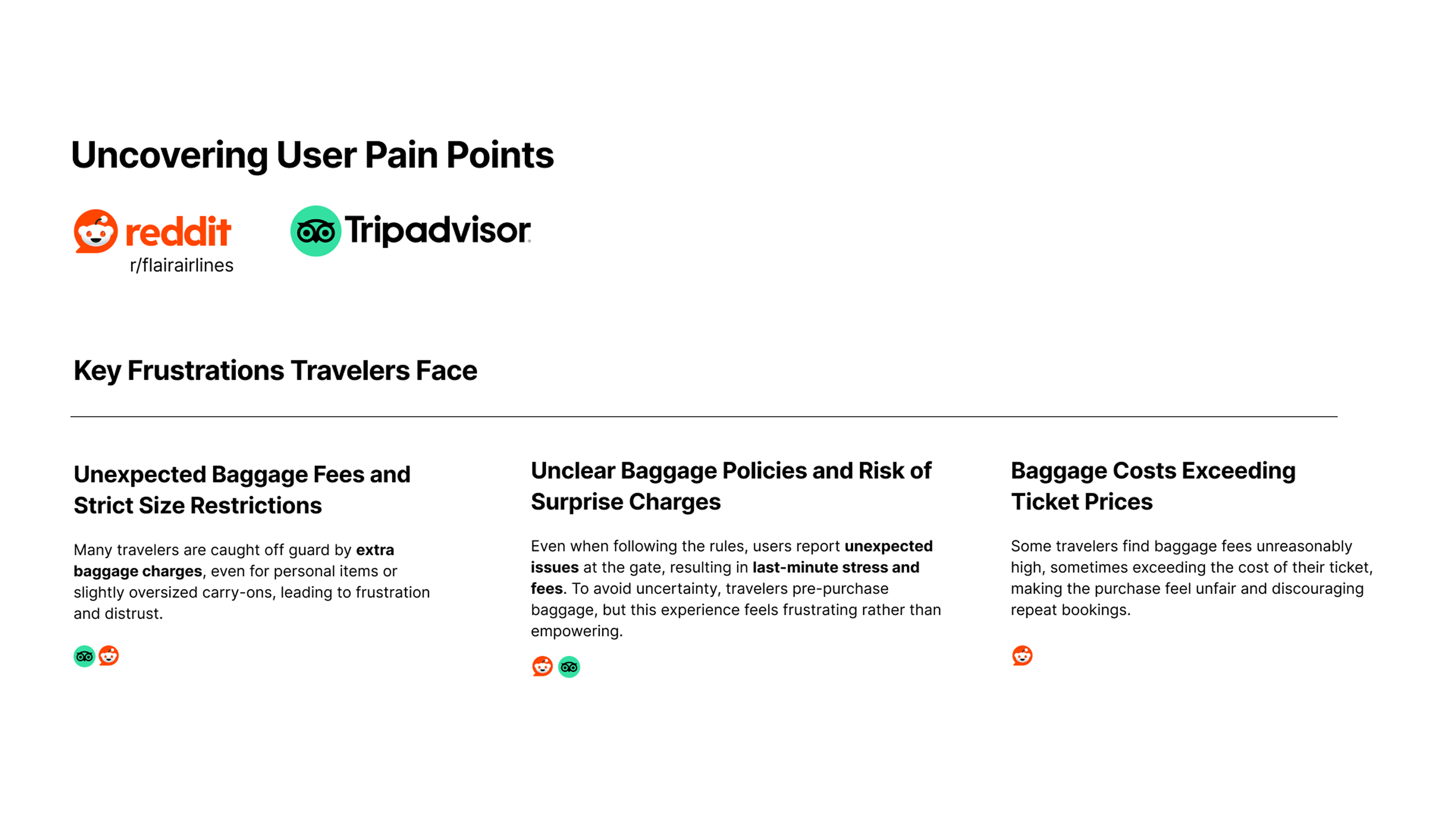
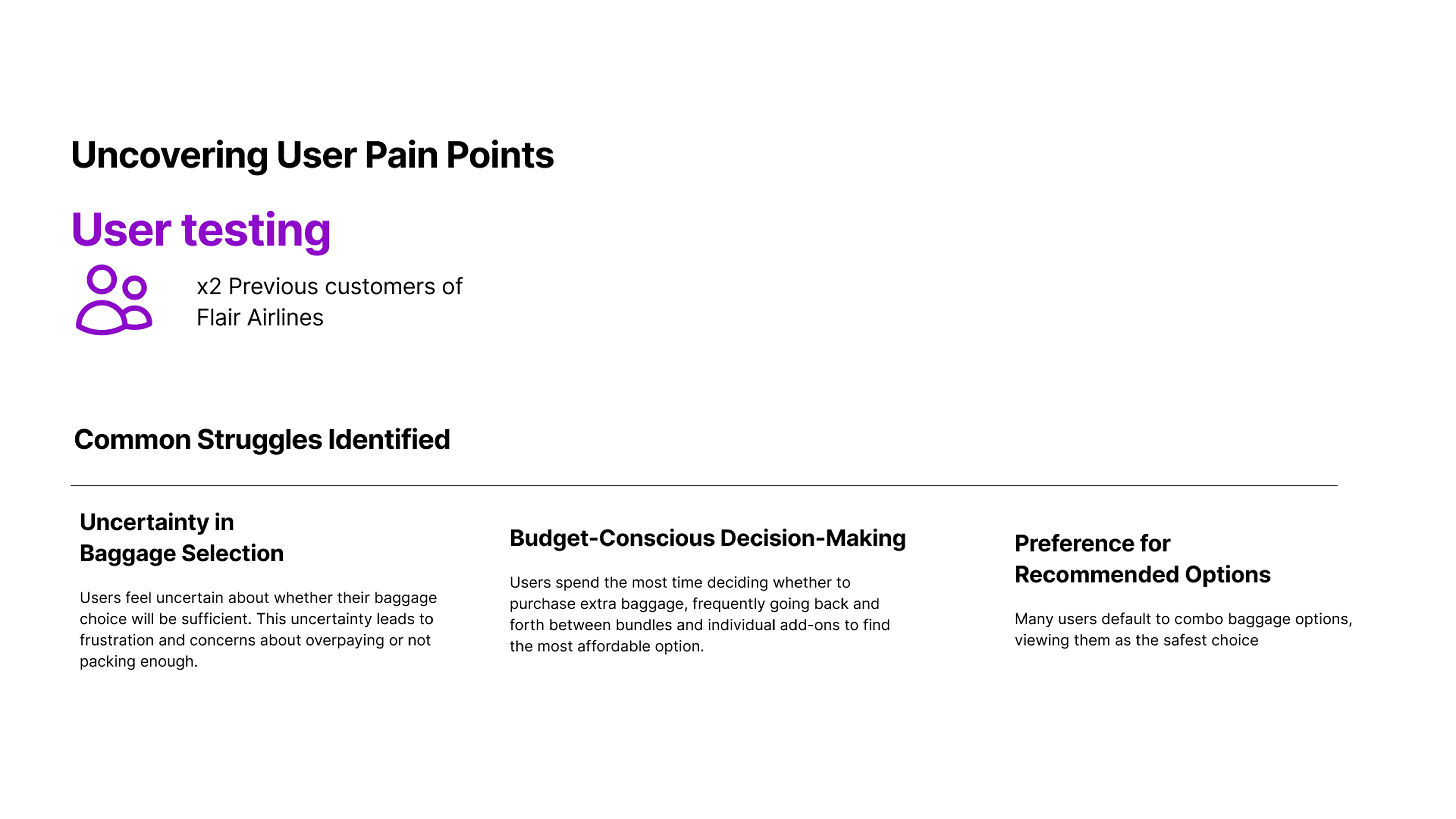
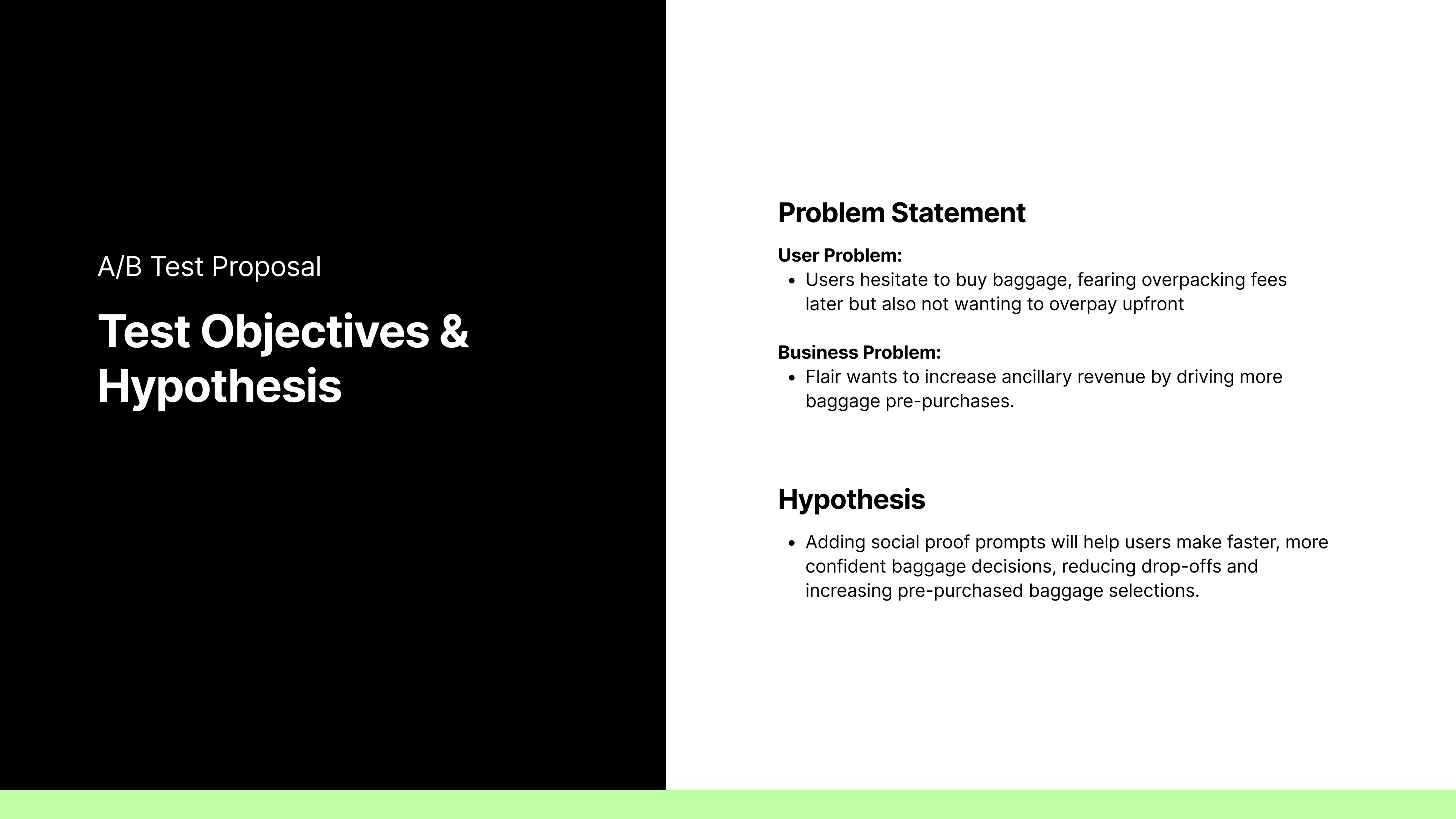
Through secondary research on Reddit, TripAdvisor, and travel forums and quick interviews with two Flair passengers, I noticed a clear emotional trend: baggage decisions were the most stressful part of booking.
Pain points I uncovered:
- Surprise fees at the gate
- Confusing baggage rules
- Paying more for bags than for the ticket itself
This led to abandoned bookings, over-purchasing, or a lingering sense of being “tricked.”
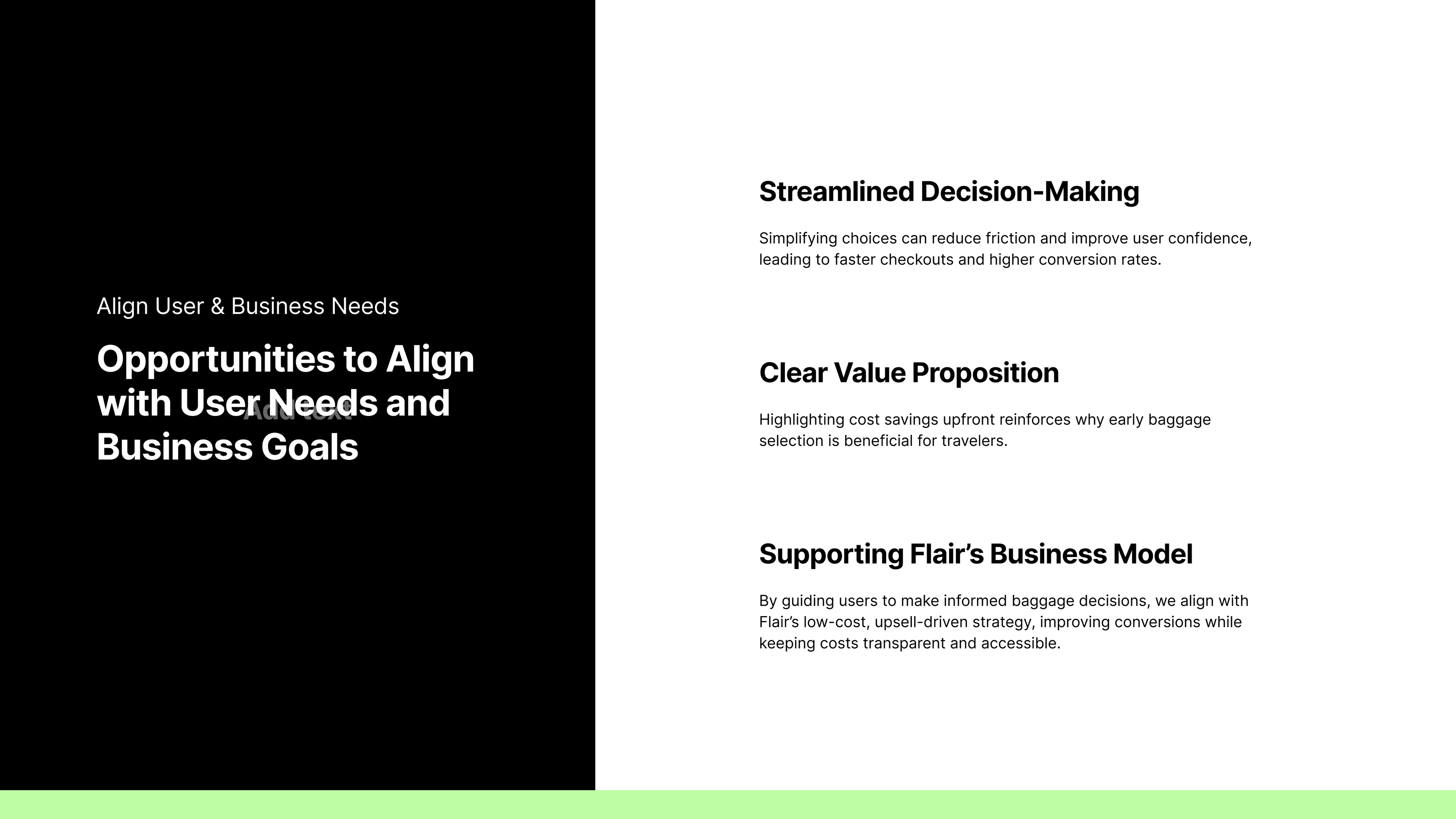
How might we make the baggage selection process feel like a valuable, seamless, and effortless choice, motivating travelers to add baggage while driving increased sales for Flair Airlines?
The real challenge was to help travelers feel they were making the right choice without overpaying or second-guessing themselves.
Designing for Confidence, Not Just Conversion
I designed two solutions, both grounded in behavioral psychology and conversion patterns from the travel industry.
1. Real-Time Smart Prompts
2. Personalized Recommendations
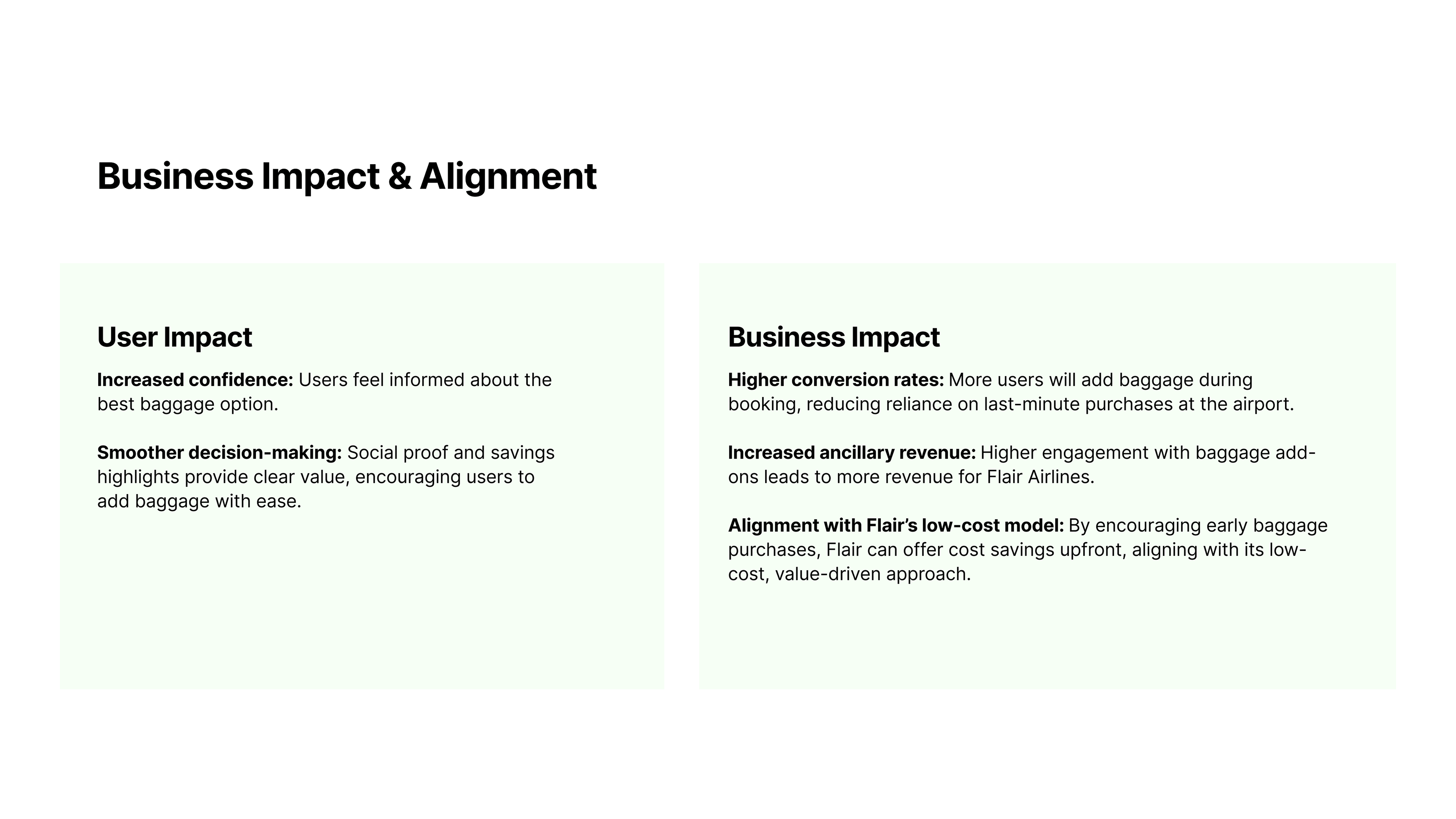
These subtle changes aimed to reduce choice paralysis, avoid over-buying, and position Flair as a transparent, traveler-first brand.
Solution 1: Real-Time Smart Prompts
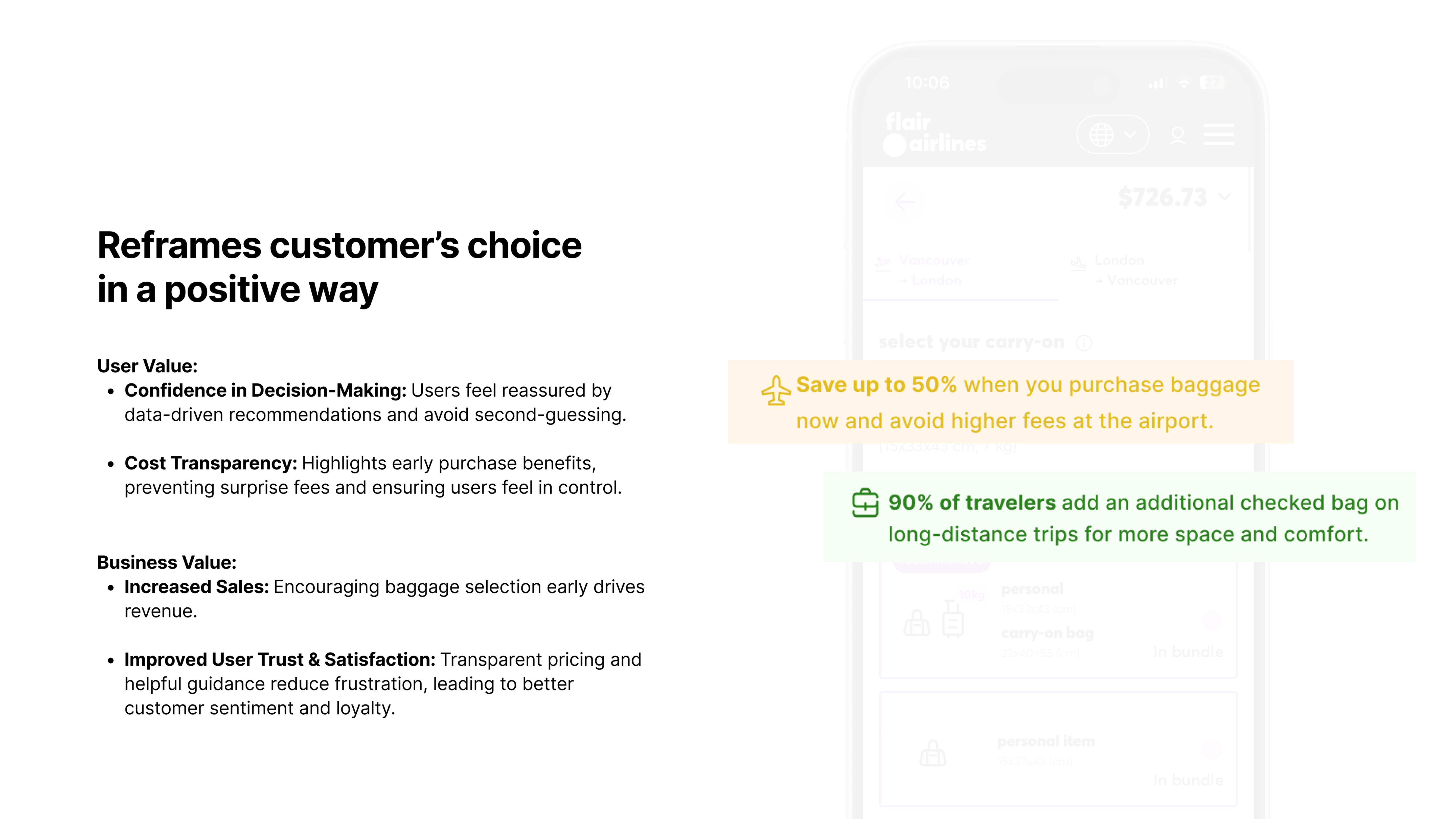
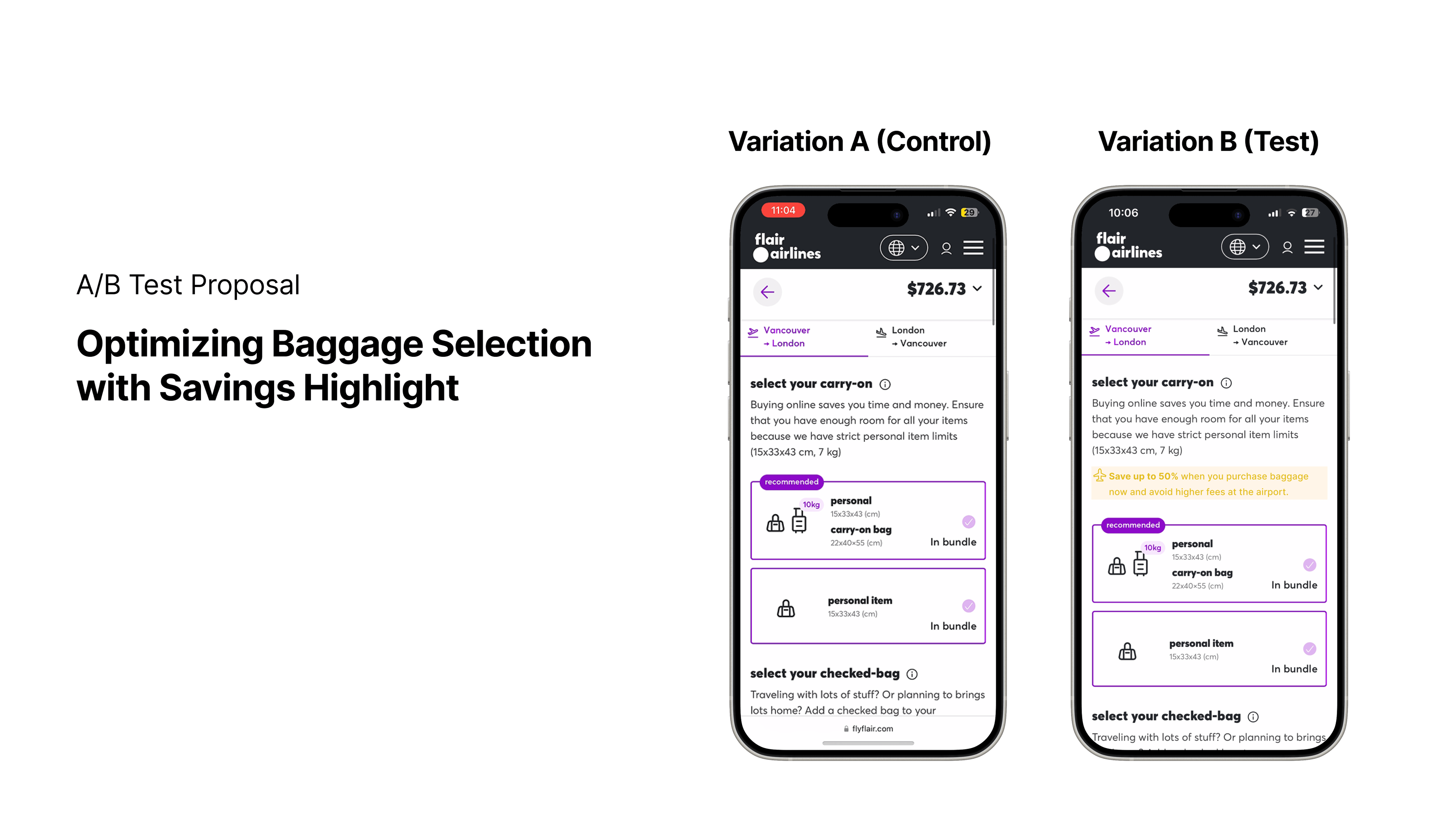
This approach added inline prompts that supported confident decision-making. For example, savings highlights would show cost benefits upfront: “Save $25 by adding baggage now.” Social proof cues, such as “Most travelers on this route add a carry-on,” would help reduce decision anxiety. This method mirrored conversion strategies from travel giants like Expedia but was tailored to Flair’s high-skepticism, ultra-low-cost audience.
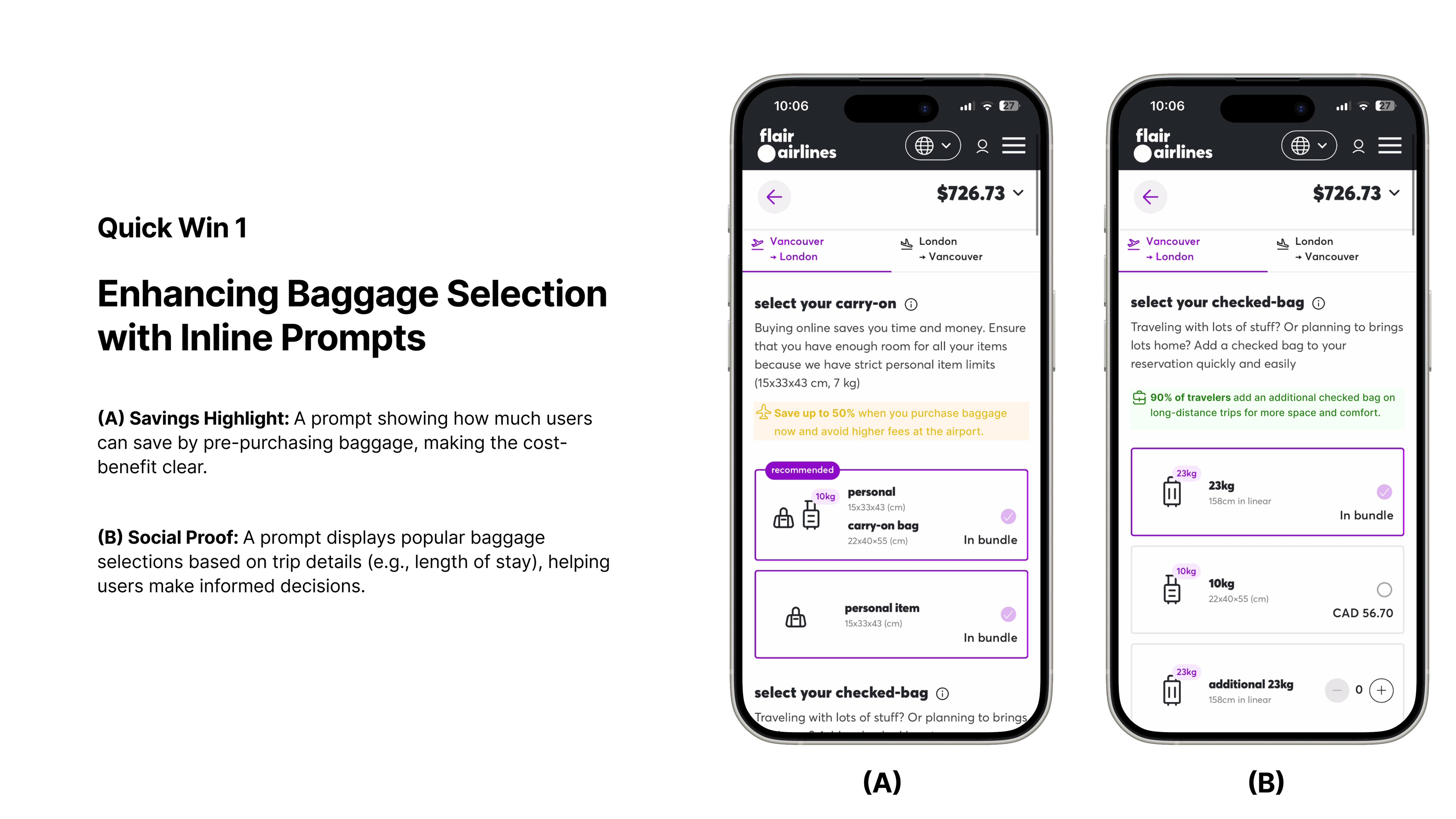
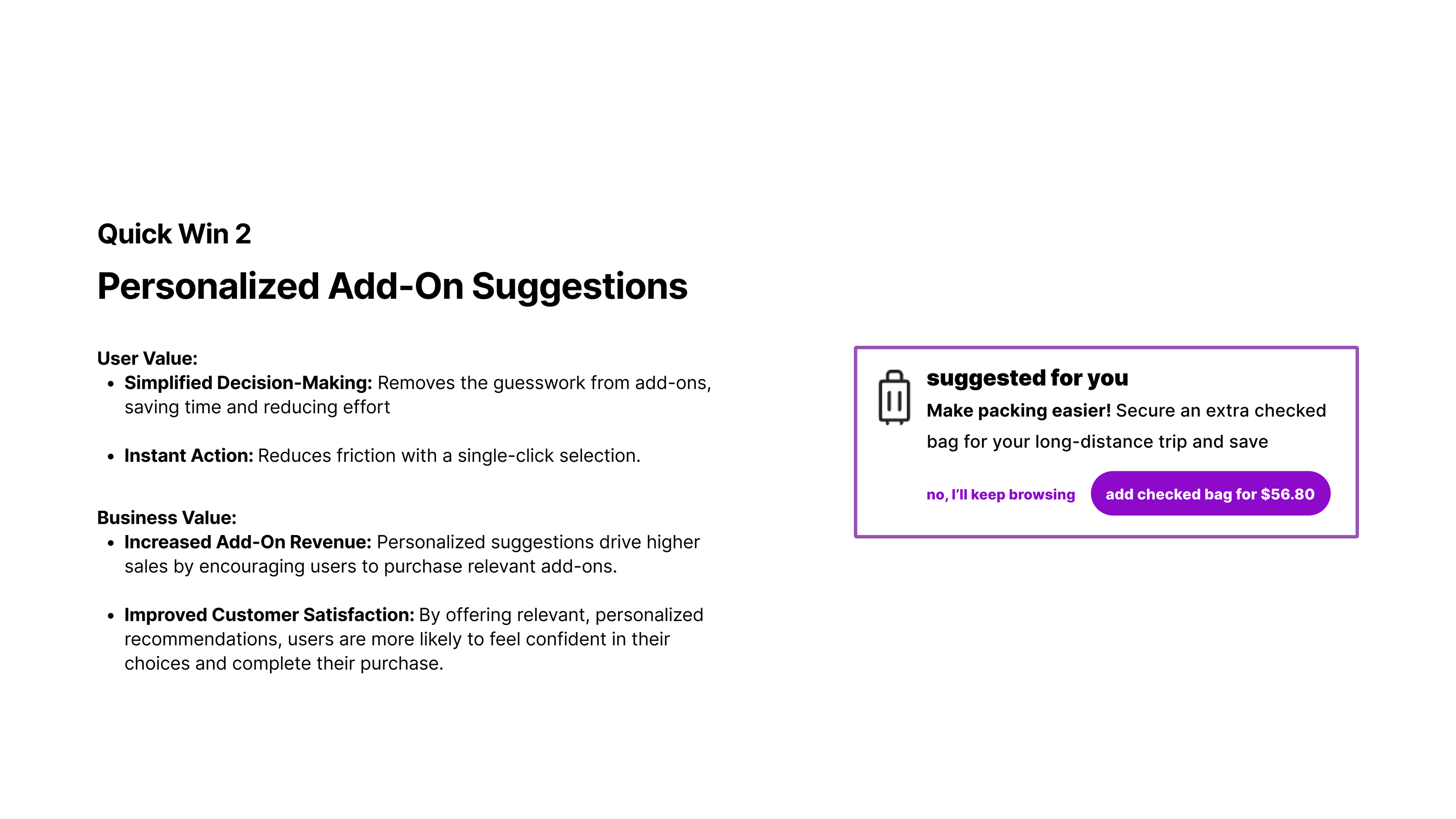
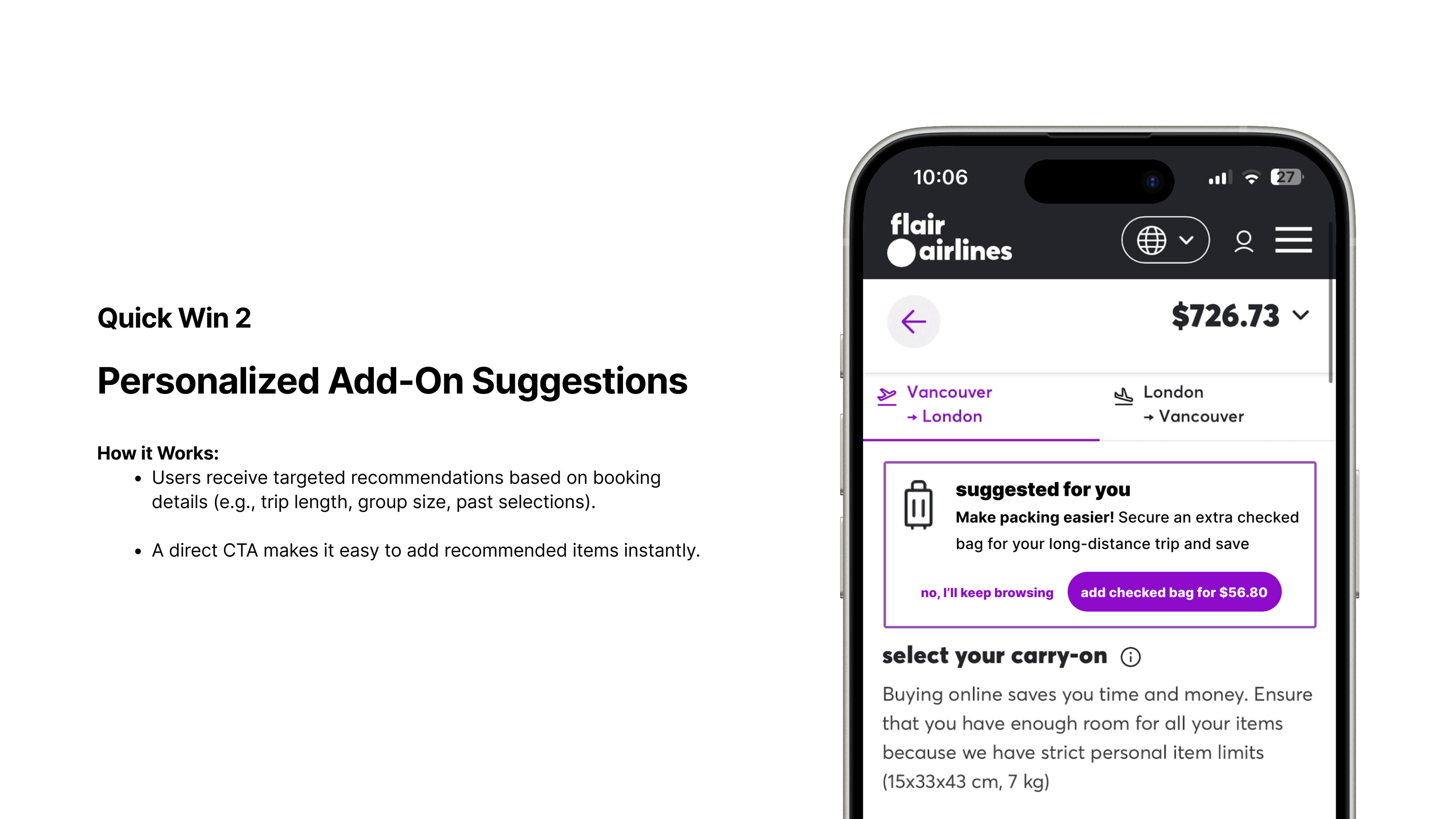
Solution 2: Personalized Add-On Suggestions
Instead of a one-size-fits-all list, baggage recommendations would be personalized based on trip length, route type, and known travel behavior. For example: “Since you’re flying 4 days with no checked bag, we recommend adding a carry-on.” This reduced choice paralysis, prevented over- or under-buying, and built trust through relevant, user-centric guidance.
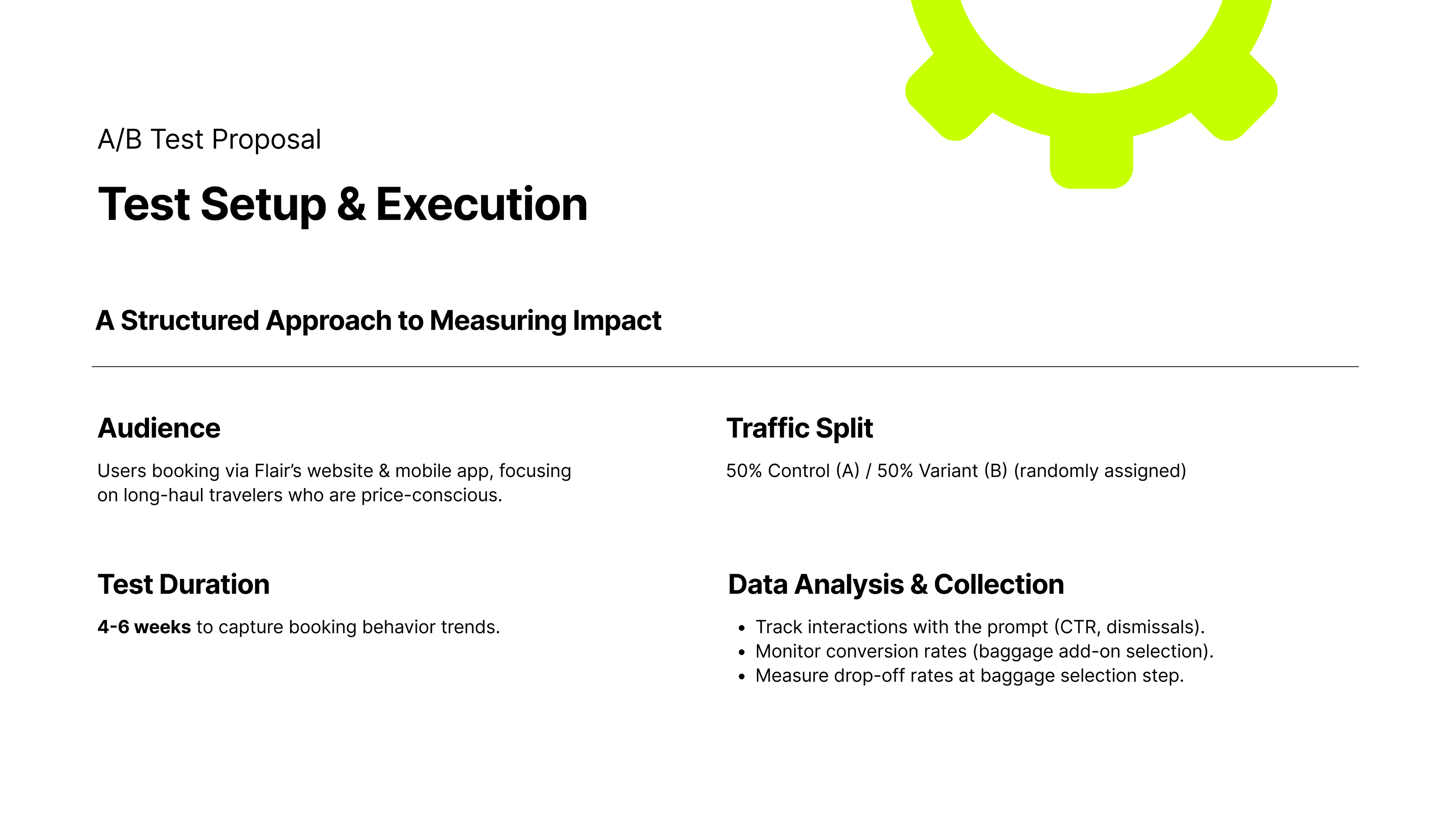
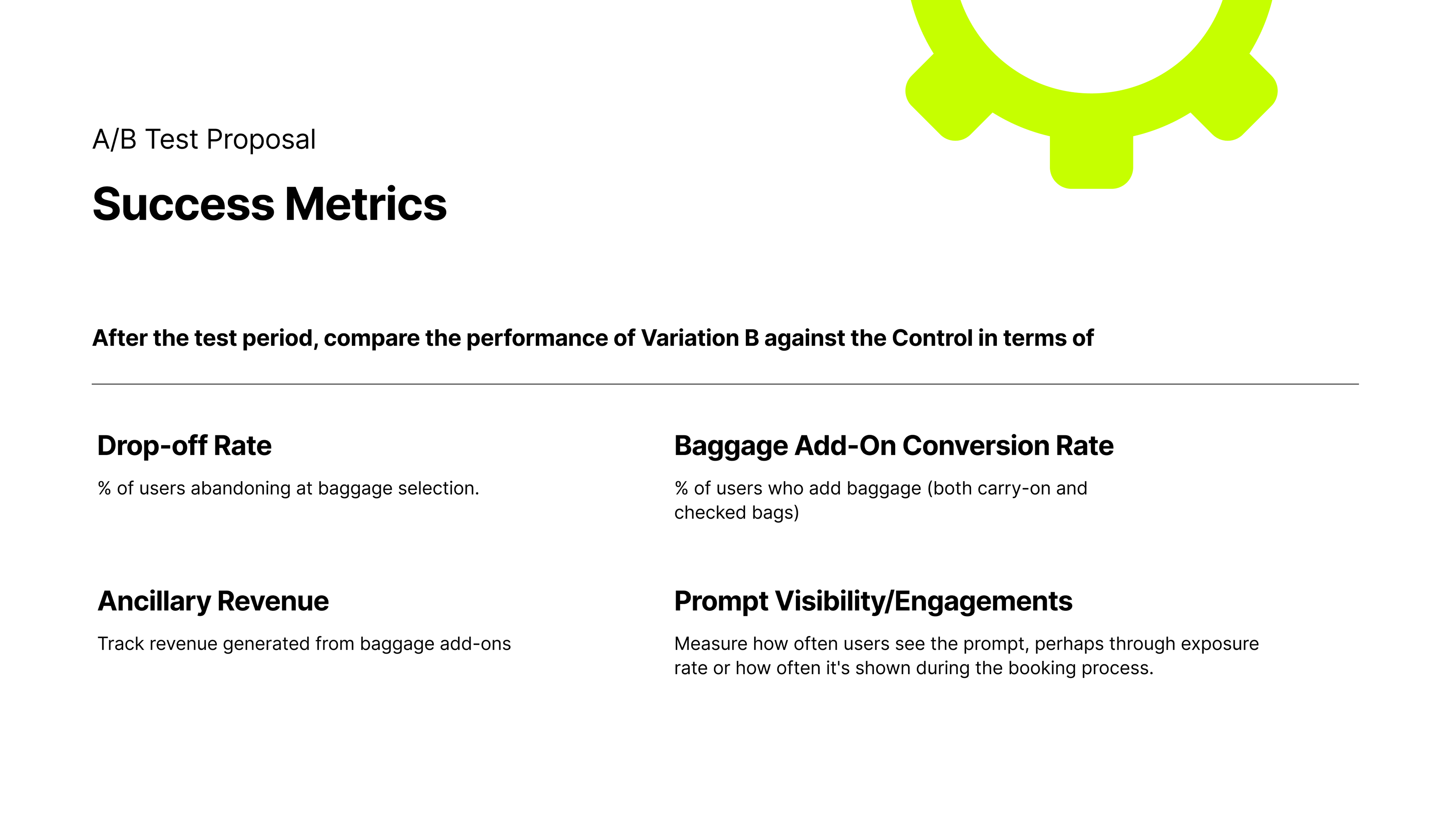
To validate the social proof approach, I designed an A/B test:
- Control: Current baggage screen
- Variant: Added social proof message
- Measured baggage conversion rate, booking completion, and revenue per booking over 4–6 weeks
If successful, the feature could be expanded with dynamic prompts and refined copy based on user data.
Reflections & Learnings
Working on this project made me appreciate how much impact small design changes can have when they’re placed at the right moment in the user journey. In this case, baggage selection might seem minor, but for budget-conscious travelers it’s often where stress, doubt, start to build.
I was reminded that clarity and honesty in pricing go a long way not just for conversion, but for building a relationship with the user. I also saw how subtle prompts, like showing what most travelers choose, can help people feel more certain about their decisions. That said, these nudges only work if they’re based on genuine patterns and communicated in a way that respects the user’s needs.
If I had more time to explore, I’d focus on fine-tuning these prompts for different types of travelers; someone booking a solo weekend trip might need different guidance than a family flying across the country. For the right company, that level of personalization could turn a moment that’s usually a headache into something that feels quick, clear, and fair.